Wednesday 27 April 2011

Digital Paper Piecing Tutorial

This is my first ever attempt at a tutorial,  so I'm not making any promises, but one or two people have asked how I made my cards for the Less Is More week 12 challenge, so here goes.  It is image heavy so I apologise if it takes a while to load.

This is just to show a very basic digital paper piecing using Photoshop Elements 7. I'm assuming that you have only very basic knowledge so may tell you things you already know or you may know a better way of doing this. There are keyboard shortcuts for the tools I'll use but I haven't mentioned them here to keep things simple.

If you don't have Photoshop Elements there are various free digital image programs available to download, I used to use Paint.Net, and Gimp is another.  They won't work in exactly the same way as PSE but the basics will be the same.

I've started by opening my image (preferably a PNG file with transparent background, but it works for JPG files and white backgrounds too). This image is from a Digisparkle set called Smartypants. Sadly the store is closing in May but Heather has a voucher here, which is very generous as the store is such good value.


I would recommend doing 'save as' at this stage so you don't overwrite your original file, click on File, then Save As, then call it anything you like! Now any changes you make won't affect the original copy of the image so its there to use another time.

Now open the background you want to use - mine is a from a polka dot pack from Funky Hand.  This particular paper is A5 in size so is much bigger than we need. If we used it as it is we'd end up with only 1 or 2 very big spots on our pants...

Use the rectangular marquee tool  to select a small area of the paper. 


Just click on the paper with the mouse, then drag the cursor in a diagonal direction. Your selected area will be surrounded by a dashed line. Then click on Edit>Copy (or I use the keyboard shortcut Ctrl+C)


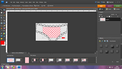
Now go back to your original image, where we want to select the area to be paper-pieced. This is really simple, click on the Magic Wand Tool, then click inside the area you want to paper-piece. Again your selection will be surrounded by dashed lines.


Now the exciting bit - it really was a 'wow' moment for me the first time I did it! To paste our paper into the selection click Edit>Paste into Selection, or (Ctrl, Shift + V if you prefer the keyboard shortcuts)


This is what I ended up with using my selection, my paper piece wasn't big enough to fill the area.  But don't panic, no need to do it again (unless you want smaller dots - in that case undo this last action, go back to the paper and select  a bigger area, copy and paste into selection again).

But for our purposes all we need to do is resize the rectangle we're pasting. Click on the Move Tool.


You'll see little squares at each corner of the rectangle, and in the middle of each side


To resize without distortion use the corner squares, just click on each one and drag diagonally until the paper covers the whole area you want. Often you will only have to use 2 opposite corners) 


When you're happy with it, click the green arrow. 


Then finally, I've just 'deselected' everything to get rid of the dashed lines around the image. Click Select>Deselect (or Ctrl+D)


And that's it - your completed image!


I hope you've found this useful and it all makes sense. I'll do a follow-up in the near future showing how I made a whole card like this.

Lesley x


Tuesday 26 April 2011

Less is more week 12...'off-centre'...2nd entry

I enjoyed myself so much with my digital designing when making my first card for this week's challenge that I had a go with some other shapes filled with colourful polka dots.

This one is my favourite - I think I even like it better than the bunting, maybe because the tail of the kite links up to the sentiment?


Then some balloons  - this was going to be a cluster of balloons but I kept the 3 separate while working on them and quite liked that effect too so not really an off-centre card this time (although the  balloons are 'floating' at the top of the card).


And finally (for now - I have SO many ideas running through my head now, lol!) - how cute are these scottie dogs?


Again with all 3 cards the polka dots and sentiments are printed directly to my card blanks, then the outlines and details drawn in by hand with a very fine marker.

Off to play some more now....

Lesley

Monday 25 April 2011

Less is more week 12...'off-centre'

I can't believe I've had such a lazy day today, have been itching to craft but really really should be tidying everything away instead of making more mess...

Then it hit me, I could create my Less Is More entry on the laptop and print direct to my card - no mess!!


This is a very basic example of clipping in Photoshop Elements. I created a new image the same size as my card front, then used the polygon shape tool to create a triangle which I copied 5 times in separate layers and moved to the right positions on my card. The digital polka dot papers, bought from Pickleberry Pop, were each reduced in size  from 30cm square to 3cm square to scale the pattern right down, and then pasted into the selected triangle shape on each layer.

I then just added the text in the bottom right corner, the font is called Mawn's Handwriting - I really wish my handwriting was like that!

After printing directly to my card blank I got out the fineline marker pen and drew on the black lines, and that's it, a finished very simple card. Hope you like it!

Sunday 24 April 2011

Happy Easter....Part 2...

My 2nd post of the day to show off the Easter gifts I made for my nieces. I'm a funny one when it comes to Easter eggs, especially when I know how many of them kids get these days. Once upon a time I bought my nieces and nephews a new t-shirt or something, but I have so many now it would bankrupt me!

So this year I went to the supermarket and bought 5 of these at 61p each, wondering if the staff would be thinking I was a total meanie, although I'm sure they didn't even give a second glance...


I have to admit they don't look very exciting, about the size of my hand, and no extra bits of goodies.  But when taken out of the horrid box and added to a handmade basket with a few other bits and pieces, this is what you get...


Each basket is made from a single sheet of scalloped 12x12 Papermania cardstock, decorated with some patterned paper that I've had for years. The little panels on the side of each basket show each girl's name, the images are from Tammy DeYoung at Aimee Asher, cute eh?

The only tricky bit came when I tried to wrap them up without spilling the contents!


 I don't think I did too bad a job, and the girls (and their mum) loved them.  That's 3 down, 2 to go... but they stand out amongst their other eggs and they've only cost me about £2 each to make.

Happy Easter....Part 1...

I don't usually 'do' Easter cards, but there are so many cute Easter images around that this year I couldn't resist making just a few.


This trio were made for my sister's 3 girls and I was pleasantly surprised to find that they loved them - they're all aged 6 and under so I thought they might be a little bit too 'grown-up', but at least I wasn't worried that they'd turn their noses up at handmade - we've had a few crafty sessions together and I take craft supplies with me most times I visit.

The cards are all made from papers and images from the Creative Cardmaking special Pink Petticoat edition, coloured with Promakers (of course!) and measure a dinky 12cm square.

The first one I made was the one at the bottom of the shot, then I worried that the little ones wouldn't 'get' the buttons (added to hide a smudge in the bottom corner of the image!). I made the other two without any embellishments, then of course thought they looked too bare for little girls, so raided my stash for the little flower and (quite hideous) butterfly.

A last minute panic when I realised that I'd spot-glittered 2 of the cards and not the 3rd one, then they were safely delivered to their recipients this morning!

Saturday 23 April 2011

Spot the difference...1 card 3 ways...

when I bought this digi-image from Cuddly Buddly yesterday I couldn't wait to use it. But oh no, disaster! My Cool Aqua Promarker has run out.  That's the 2nd of that colour I've got through, I obviously use it far too much! This was the best I could do before it completely gave up the ghost...

Looking at it now I quite like the 'shabby chic' finish I got on the stove.  This card uses a combination of digital paper-piecing (the red polka dot areas) and hand-colouring, then the images were cut out and stuck onto the gingham backing paper.  I designed the sentiment myself using MS Word.

Of course I've ordered another Cool Aqua Promarker (and a few other colours that I 'need') but couldn't wait, and really wanted my stove in that colour  - I love the contrast with the pink gingham and red polka dots.  I decided to try to replicate the colour with more digital paper-piecing, and since the backing paper is also a digi I did it all in one layer to save on ink (and cutting out time) and this is version 2....


I decided to polka-dot the kettle on this one, and make her dress the same colour as the stove to add a bit of balance.The rest of the image I left white and hand-coloured. I quite like the colour on this one, but its more blue than aqua.  So, my final attempt at stupid o'clock last night....


Now this one is far too green! I feel like Goldilocks or something...! I do prefer the digital layering on this one though.  I've left a little white border around the images, to give a more obvious layered effect, I think it just about shows in the picture.

That's it for now, no more till the new Promarkers arrive!

I'm going to enter these in the challenge over at The Play Date Cafe which is a colour challenge, don't you think they're a perfect fit?


Friday 22 April 2011

Less is more....acetate

I haven't given myself long before the deadline (again!) so I'll keep this one short.

This is my take on a Less Is More card using acetate


I've kept it really simple, with the acetate attached to the card blank by turning the card with the fold facing the wrong way, scoring a small border on the acetate, then sandwiching the acetate between the 2 layers of card blank, sealing on all 3 sides with double-sided tape.  That way there are no edges to hide, and the acetate becomes the front of the card.  This pic might make it a little clearer (if you'll pardon the pun!)...


The card blank is 5" square and pearlised, though it doesn't really show up in the pictures, I think its from The Works.  Then I've simply added a die-cut (from Papermania?) and tied a ribbon around the acetate front. I might add a sentiment before using the card, but don't think it needs one.